Monster Inside
“We had to do a vertical slice in 4 month for our game concept. The game is an horror-coop asymmetrical adventure. I’ll tell you more about what i have done.”
Context
Collaborators:
Louise Jandot dit Danjou - Producer
Marie Pakula - Game design
Maël’lo Vauchel - Game design
Rémi Decorne - Art
Ajay Prgs - Art
Hélène Malherbe - Art
Tanguy Depraz - Programming
Mathieu jacquemet - Programming
Gorik Gazarian - Sound design
Project duration:
From october 2023 to february 2024
(4 months)
Link:
This project is done as part of my master’s degree second year. We done it during the last four month of the scholar year (exactly like the first year 4 months project). We were 9 persons on this project (two game-designer, a 3D artist & two 2D artists, two full-time programmers, an UX designer, a sound designer and a producer). I work closely with the rest of the team to define core features, and integrate UX processes as early as possible during the different production states. I also had to be careful about the project accessibility, creating and adding different features for accessibility purpose.
My missions were:
- Define project scope & direction with the team.
- Define user target & game flows
- Prototype interactions & flows
- Analyze and design accessibility features
- Playtest and give feedback to the teams
- Facilitate teams communication with good documentation
Process
-
Define project scope
Who are we designing the game for ? What concurrent games do ? How are we original from theses games ?
-
Define user stories
For each features, what can players do ? What are their needs ? Do we have different way to solve a puzzle ?
-
Discuss the needs in UX
Ask the team what they want to be answered regarding the player experience with the game in order to conduct a playtest.
-
Prepare and do playtests
Plan, recruit and do the playtests. We need to test our flows and game elements.
-
Follow-up & iteration
Write and present the playtests results. Discuss and change games elements and direction to better suit flows/players needs for the game.
-
Researching Accessibility Features
Searching and learn what can be done to make the game more accessible for more type of peoples (blind, deaf, mobility-impaired).
My work
This is a selection of the different things i done on this project. You will see some of my UX/UR works.
All i did for this project on UX was:
- Personal Interviews with the team members about their UX’s expectations
- Workshop defining the horror genre of our game
- UX review / Benchmark of a similar game to ours
- Observation methodology & Focus Group
- Survey about players experience of horror and/or coop games
- Persona
- Playtests (2 in total)
- Accessibility
- Assisting on UI design
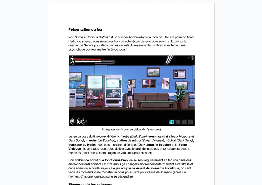
UX review of “The Coma 2 : Vicious Sisters”
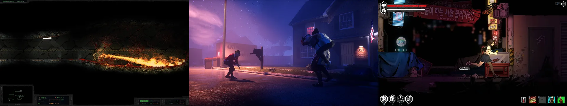
I needed to learn more about the games similar to ours, so i decided to play “The Coma 2 : Vicious Sisters” a game very similar except for the cooperation aspect missing.
I emphasize my review on how detect threats around the players when your camera is placed closely to the player character. I also reviewed the ambient of the game and the game mechanics.
For each aspect i explained and review, i have add some screenshots of gif to my explanation.
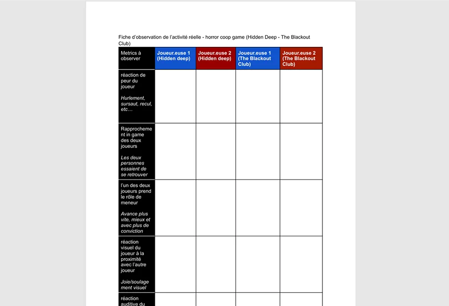
Observation method & Focus Group
First i organized an observation of some friends playing two horrors games i proposed them (they weren’t forced to play games they don’t want) and i wanted after the play session to do a focus group on the experience they just leaved. But i needed to cancel the focus group, the play session was longer than my friends and I wanted. The focus group would have take too much time for everyone to stay focus all along.
Beside that, the observation session was great. After each observation, we discussed about the game, their experience with it, and other things. Within the next days, i present the results of theses moments to my dev team, detailing what the players did most and why. I also tell about theses moments of discussion we get between us. This help better understand the friction and success of theses games.
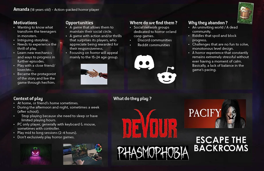
Survey & Persona
After reviewing a game, checking with my coworkers how they value the UX and reviewing players on coop-horror games. I decided to convey two different surveys on differents Discord servers dedicated to the topics of the surveys. I searched for Discord servers centered around horror games and ones centered around coop games.
I decided with the data of this survey to rapidly create a relatable persona that team members could easily connect with. I also added in this persona a tool i discovered during the conception of the personas, the “gamer motivation model” of Quantic Foundry.
Accessibility
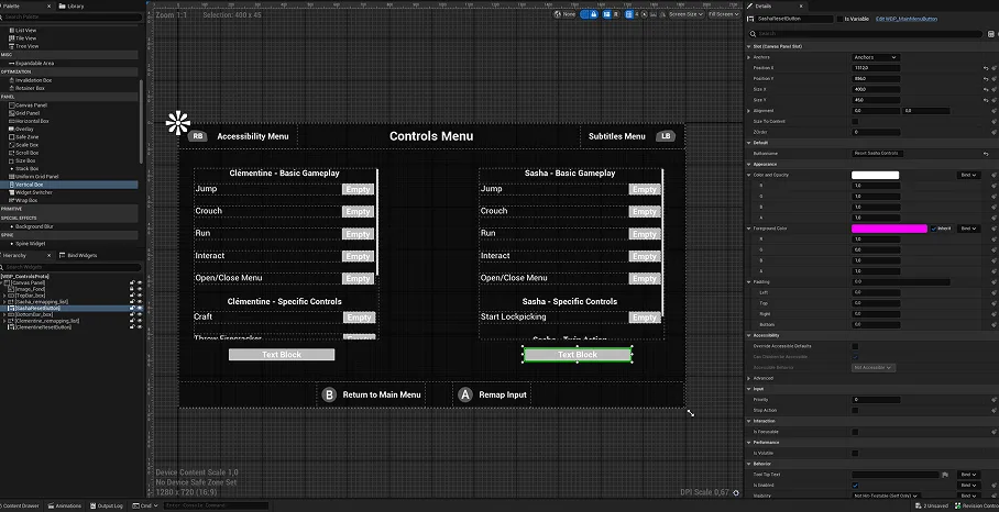
For the accessibility of the game, we needed to think about everything a AA/AAA game would have. Like Full remapping of controls, Color Blindness features, Full subtitles, font parameters and difficulty settings.
We were asked to also have two other accessibility features, being original and adapted specifically to our game. We decide to think about 2 different additional features :
- A content warning system letting you skip narrative moment implying the triggers you chose to be warn about. This feature includes a brief text and voice-over recap of what you skipped to keep players aware of the game narration.
- An auto aim assist system linking the player’s sight to the objects interactable with projectiles. Also this system let you when you need to launch a firecracker elsewhere than on an object to choose a length for your shot with a button press.
67
The challenges
Working in a bigger team with different schedules
I never work in a project this long (4 months) with a team of almost ten people. Because the UX is something touching every jobs in a production (game-design, sound, art, programmation), i had the issue to see everyone with a limited time. I needed to know the whole project direction and the decisions the team members made individually, to be able to help with UX methodologies fitting the needs of my coworkers.
This make me take time to see everyone, and modify what i prepared to better suit the needs of my team. It was really great to be able to adapt my work and research like this. I felt really part of the team, my role meaning something in the end!
Don’t lose myself with methodologies non-useful at the time or too long to be done on this project
Every project doesn’t progress like it was expected. Its a thing of our industry, the struggles. And with this project, we get a lot of theses moments were we changed things we planned early. This was the case for my UX methodologies, i was starting with a base plan for the whole production. It changed quickly as i discovered methodologies and things better suited for this project.
I think I learned a lot during this game production, and it was challenging to make changes and update my plan. But it ended to be really enjoyable to see that the updates and changes i did where the good ones.
05
See it with today’s eyes
Do a better UX review !
The work i did in the past is good, i think the only things i will change is adding elements to my review. My document is good to help my coworkers on different game aspects (like game-design and sound-design), but it didn’t help me for UX. I didn’t analyze the UI, why it is placed like this. I didn’t check if there were any accessibility features. At one moment in my document i mentioned the frustration i fell in a part of the game, but i needed to emphasize more on that and note every moment i fell frustrated and why.
Update how i made the persona (and create another one)
As today, i think this persona is better than my previous one. I did multiples personas, but not for the user story, i did them to focus on the genres preferred by the target of Monster Inside (coop or horror). I based like the “‘Round the Valley” one, my persona content on the survey. I better understand what i need to write on theses personas than the previous ones. The issue is the visual complexity on theses personas, they doesn’t need this much visuals. Less visual impact is best for capturing important informations.
Other examples of things I will change : Less examples on the motivation category, a quick explanation of what the symbol on top right is for my team (the bard quantic foundry player type). And lastly separate the “context of play” from the persona sheet, because they share globally the same things and this can be visible aside to save space.
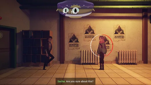
Another accessibility feature I could have designed for this project
I thought about another accessibility feature that can be done for this game. A visual ring around the selected player character to visualize the sounds around them in order to have sound disabled person being able to play the game.
A ring visually similar with the one present in “Fortnite”, “Doom : The Dark Ages” and other titles.